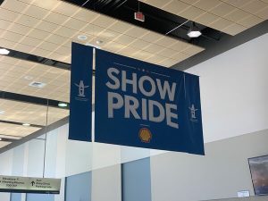
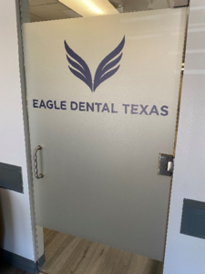
First impressions matter, and your company’s signage is one of the most essential ones you can create. Your storefront signs reflect your business and your devotion to your consumers, from the mounted storefront letters that welcome people into your store to the branded experiences they discover within.
High-quality signage can be a great business selling point, driving client loyalty and a competitive advantage. However, making your impression with signs requires much more than smart design and placement. Agility, attention to detail, regulatory awareness, and the capacity to execute across your full network of locations are all needed to be successful.
This article will focus on how custom storefront signs can improve your brand’s impact in your area.
THREE AREAS WHERE VITAL SIGN SOLUTIONS FOCUSES TO GUARANTEE YOUR SIGNAGE IS WORKING AS HARD AS IT CAN FOR YOUR COMPANY
Know The Power Of The Right Location
The placement of your signage can have a significant impact on its efficacy. Signs concealed away from view are unlikely to draw much notice and are less likely to have any actual influence on foot traffic in your retail business. That’s why picking a visible installation site is crucial.
Examine the area around your shop to discover the best position for your retail signage. The more people pass by your storefront channel letters, the more people will notice your business and take action.
Keep It Short But Concise
The longer it takes to read your material, the more confusing it can be for passersby. When people stop on the street, they want to avoid reading a long, convoluted message, so don’t offer them one.
A short, basic message that delivers your point instantly is nearly always more successful than a lengthy statement. Remember that you have very little time – typically only a few seconds – to connect with each consumer.
Always aim for the “two-second” rule: Passersby should be able to read and comprehend the content on your LED storefront signs in two seconds or less. If your signage takes longer than that to read and understand, it will most likely be overlooked by a large proportion of individuals.
Use Bold And Clear Fonts With High-Contract Combination
The easier it is to read your signs, the higher the response rate will be. Choosing a complicated and difficult-to-read typeface may match your store’s identity, but it will typically diminish the impact of your storefront-illuminated letters.
The ideal typefaces for retail signs are bold, crisp, clear, and strong. Avoid employing typefaces that are too intricate or ornate in your signs since they are illegible, especially when viewed from far away.
The more contrast in your sign, the more noticeable it will be. Color combinations with high contrast, such as white on black or yellow on blue, stand out from a distance and help your content pop out of its surroundings. Choose a high-contrast color scheme that complements your logo and makes it easier to see and understand your signs. At the same time, avoid going overboard with colors that clash and make your signs readable but unappealing.
Houston’s Storefront Sign Expert
Vital Signs Solution takes pride in exceeding our client’s expectations by offering high-quality personalized storefront signs. We understand the importance of striking the proper balance between leaving a lasting impression and displaying a beautiful design for your signs. Learn more about our various storefront signs directly from the pros. Please contact us for a free consultation.


